
Brilliant Maps for Curious Minds
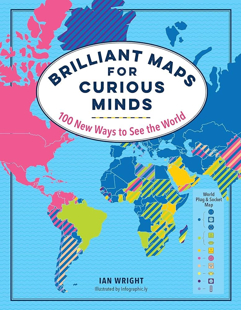
Brilliant Maps for Curious Minds: 100 New Ways to See the World
By: Ian Wright
[Fulfilled ‘A book with a map’ for Shelf Reflection’s 2023 Reading Challenge]
This isn’t really a book that you ‘read’ as it’s basically just a book of interesting maps. But I still counted it for my reading challenge, so sue me.
Ian Wright maintains a popular website called Brilliant Maps in which he creates and compiles interesting maps. This book comes from there and includes 100 color maps organized by category (Geography, History, National Identity, Nature, etc).
There is an introduction in the book that explains some of the background and the author shares some of his favorite maps or the most popular maps on his website.
The rest of the book is just full page, color maps that depict a variety of information from a world plug & socket map, to maps on populations, about wars or products and much more. Some are surprising, some are funny.
Even though there are not many words to read, you’ll still learn a lot in studying this book!
Here are some of the maps I liked most or thought were surprising or interesting:
There is a map showing each country’s highest source of imports. By and large China is the most represented. However, it’s the least represented in Europe in which most countries import from Germany.
There is a map that lists the various locations around the world with the longest names and then their meanings. For such long names, the meanings are often short and comical. The longest location in Australia means: ‘the devil urinates.’
There is a map that shows all the countries that the UK has invaded… which is almost everywhere.
There is a map that shows that Nordic countries have a lot more love for heavy metal music than other countries!
There is a map that shows that there are more annual murders in the US than many other countries combined— countries that include basically all of Europe, Australia, Japan, China, and Canada. What?! That’s an insane statistic to me.
Also along those same lines, the prison population in the US is almost double that of Russia. Is that because Russia just kills their criminals? I wonder if their annual murder count would increase if you take into account government executions?
There is a map that shows terrorist attacks across the world and their intensity. In the NW part of South America there is a large concentration of terrorist attacks that I found interesting. I’m not sure what the motive behind those are.
There is a map that shows the fastest growing religion per country. I do find this map a little misleading because showing per country doesn’t actually tell you which religion is fastest growing overall globally (which I believe is Christianity)
Looking at these maps encourages you to do further study, to ask the question ‘why?’ and try to figure out what could lead to the results we see. While most of the maps are pretty one-dimensional, many of the maps can interact with each other and flesh out the ‘why’ a little more.
For example, there is a map that shows the fertility rates of different countries (how many kids per household) and there is a map that shows the average age of people in different countries. You can see the correlation between lower fertility rates and higher average age. The less kids people have the older, over all, their population will be. Among many things, this does have an economic impact on a country and the fact that the US Social Security program is about bankrupt is exhibit A.
I think my favorite map is on page 117. I’ll put a picture of it here. There is a circle placed on the map and the following statistics are true of the people INSIDE the circle vs OUTSIDE the circle. First- The population of the circle is larger than the population outside the circle.
But also: inside the circle (vs outside) are more Muslims, more Hindus, more Buddhists, and more Communists. Also inside this circle is one of the least densely populated countries in the world (Mongolia), the highest mountain (Everest), and the deepest ocean trench (Mariana). It was a little mind-blowing to think about all of this.
Although some of it isn’t surprising because we know how populous China, Tokyo, and India are. I heard a statistic that 1 in 6 people in the world lives in India. And their land mass is smaller than the United States.
Anywho, well done to Ian Wright for figuring this map out! I don’t know what it all means… I just know it’s interesting!

Recommendation
It’s a fun and interesting book to read and may be a good discussion starter, a good resource for teachers, or just a nice little coffee table book.
The book is high quality and you’ll learn some stuff.
Would recommend.
You can order a copy of this book using my affiliate link below.
Share this book review to your social media!